Redesigning a winery’s website with an effortless detail-oriented experience for users

Overview
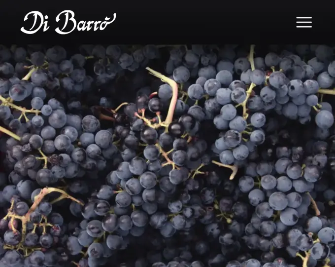
The Cantina Di Barrò is a family owned winery based in the Western Alps, Italy. This local producer offers high quality wines and annually stores around 20,000 bottles, all sourced from the grape variety growing in their 4 hectares vineyards. Their delicious wines can be enjoyed during gastronomic events, by visiting their cellars and vineyards, in local restaurants, or alternatively purchased, though there’s a limited amount.
Their previous webpage, dating back to 2011, was outdated and did not meet modern web standards. They needed a new website and sought to communicate their products and the story behind this family tradition.
I was the sole designer in this project and I was responsible for the whole design process, from learning about the client’s goals to helping them get there with the developer’s help.
Connect
- Meetings with client
- Old webpage analysis
- Interviews
- User persona
After some meetings with the client, I took time to review all the information gathered about the brand identity, user target and communicative intents. Then I analysed competitor websites and benchmarked the client’s old website against them, getting ideas for the redesign.
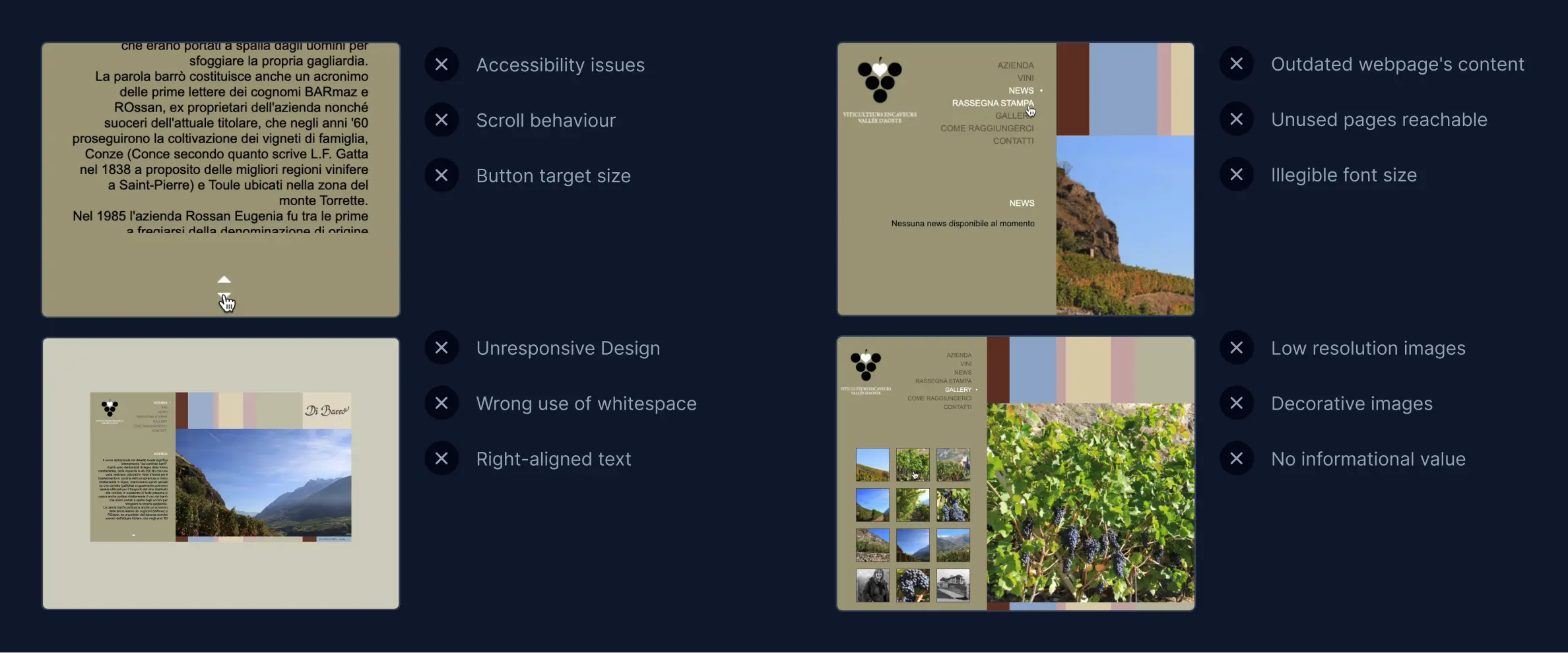
Considering the engagement level of the old webpage, I could assess the content didn’t meet user needs and wasn’t up-to-date. Furthermore the webpage wasn't optimised for smaller devices. Testing the navigation and reviewing content layout I identified usability and accessibility issues:
- 1All default scroll behaviour of touchpads, mouse wheels and touchscreen were disabled, instead the scroll was triggered by hovering two buttons
- 2The two buttons consisted of small icons, a triangle pointing up and the other down. They lacked minimum target size, hindering the access of users with difficulty in operating small controls or with disabilities
- 3The top of the webpage presented two logos, this was misleading and built user’s confusion on the business’ brand identity
- 4The website's layout was centred with fixed width and height. It was a condensed structure misusing whitespace
- 5Among the seven navbar links, two directed to a blank page on user's click. Unused pages should not be reachable
- 6The gallery page depicted a small amount of low resolution images, which resulted decorative and useless, without context or informational value
- 7The written content was a block of right-aligned text fixed in a column. It was illegible due to font sizes smaller than 12px
- 8The webpage was unresponsive. Smaller viewports were not considered and this decision led to a scaled down layout, illegible and inapproachable on smaller devices
The creation of a new website required content revisions and strategic design changes, ensuring a comprehensive improvement over the old website.
The website would be used by tourists, people interested in the winery and wine enthusiasts. To identify the best solutions for users I had to learn more about their problems and put myself in the their shoes. Collecting some insights could help me understand their opinions, feelings and motivations and then empathise with their challenges. I led some interviews with different costumers paying attention to their behaviours as well as their verbal responses. Identifying aspects such as discomfort or enthusiasm in the wine connoisseurs helped me consider their different needs and distill a user persona.
I fabricated an archetype representative of most target users who would be both viewing the products and trying to contact the winery to purchase or visit. Creating this concrete instance was effective, as it constantly reminded me the user’s standpoint value which sometimes, to content the client, can be left behind.

User Persona
Matteo Rossi
Matteo is wine enthusiast, a restaurant owner and chef. He usually plans menus, ensuring that the high-quality food is well paired with a wine. He is often searching for new exclusive wines to feature in his restaurant. In order to purchase these products and build relationships with their producers, he usually attends wine fairs and short trips to France and Aosta Valley discovering small local producers.
- Discover unique wines to feature in his restaurant
- Get in touch easily with winemakers and vineyard owners
Difficulty finding specific aspects of a wine
Limited time to research due to a lack of patience and a rigid work schedule
The persona targeted was clearly detail-oriented but valued speed too. These aspects helped me taking decisions easier while designing the Contacts, Wines and Detail wine page content.
Craft
- Informations flow
- Typography
- Visual design
- Wireframes
I needed to create an enjoyable interface with an efficient and streamlined design, settling the old website problems, meeting target user’s expectations and needs. In order to grant easy access to the content on smaller screens, I chose 4 breakpoints letting me control and adapt the layout on different devices. Then I collaborated with the client and created a coherent narrative, effectively communicating the winery’s identity. Finally, to guide the user through the website we established a clear hierarchy and information architecture ensuring a fast research for the information needed.
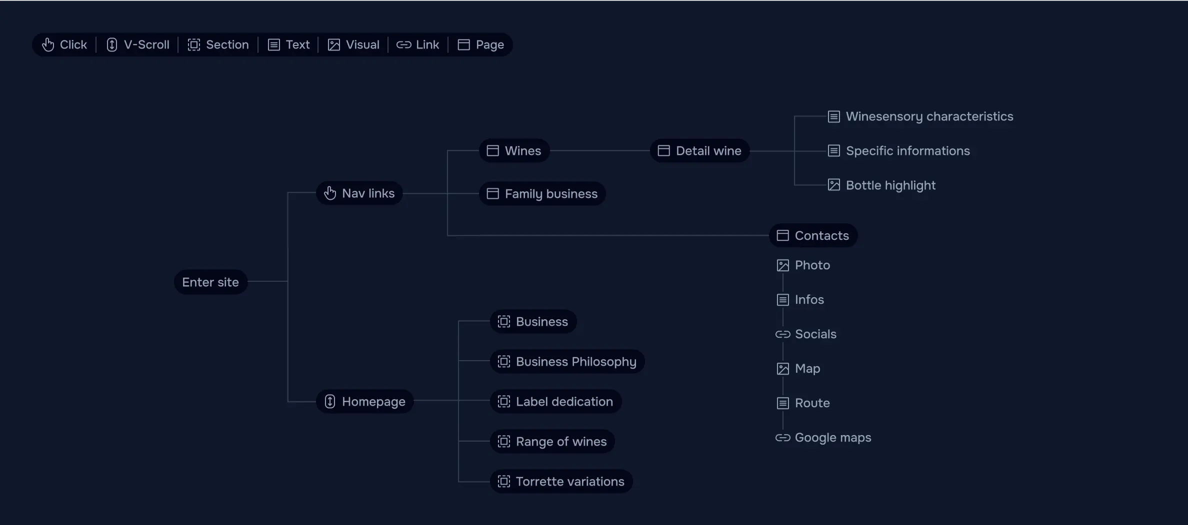
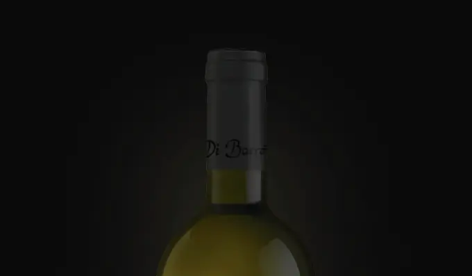
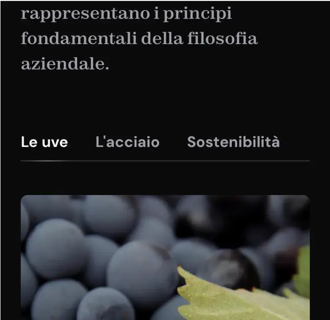
Since entering the website the user is presented with two options; he can choose whether to scroll on and follow the business presentation or to click on the cta wines and contact. When clicking on the button wines, the user can access to the Wines page which provides a list of wines divided in categories, each name if hovered shows its bottle preview else clicked the user is directed on the Detail wine page.
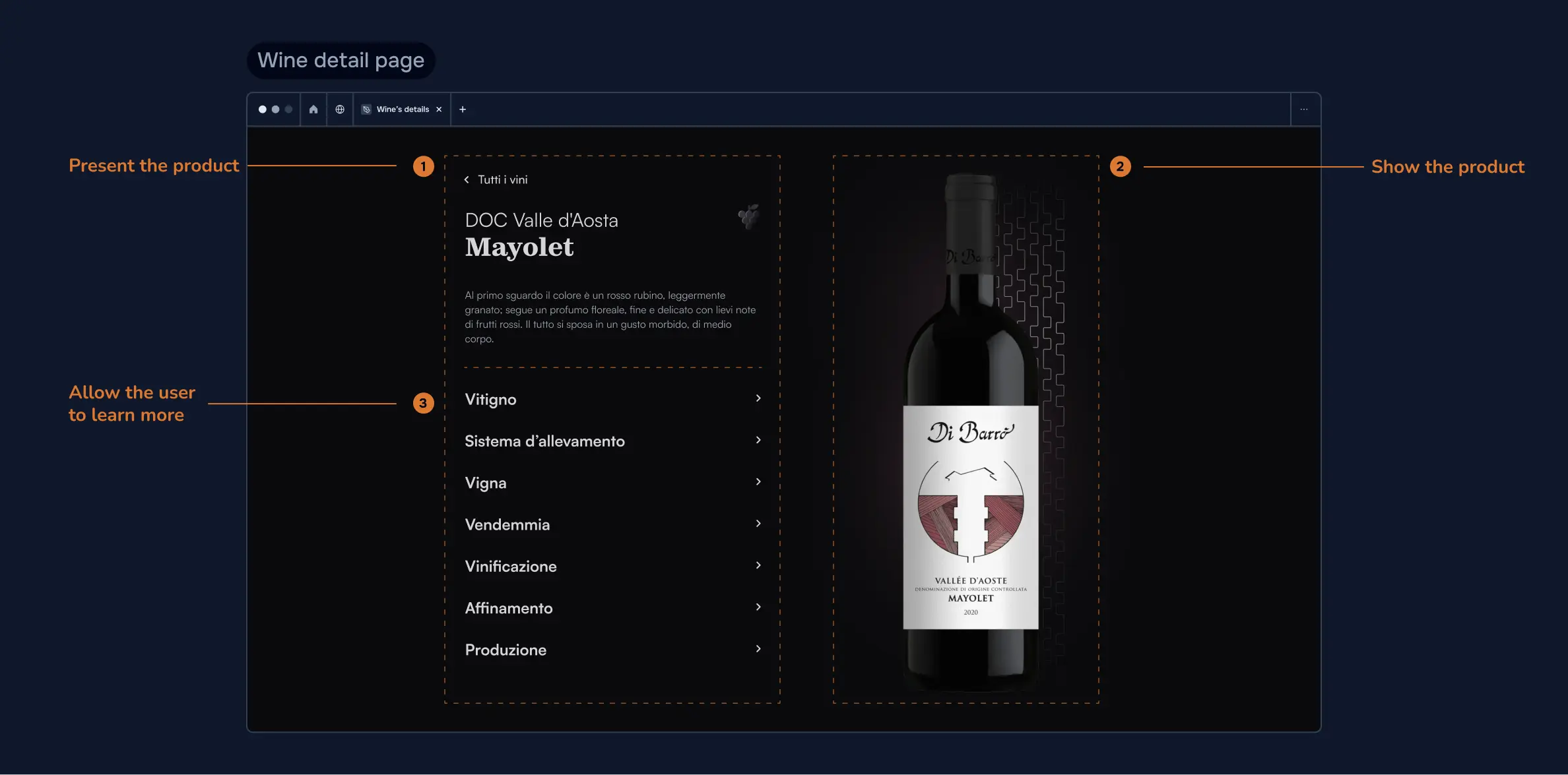
Detail wine pages had to contain all the informations useful for the customer, but with a fast and easy access, due to the short amount of time of the user. A good balance and hierarchy helped with that, but it was challenging to achieve. All the content had to be organised within the viewport, or else reachable with a minimal scrolling. By breaking it into sections, I could assign different positions, layouts and purposes.
- 1Present the product with concise tasting notes, well depicting each wine flavours and aromas and attracting interested customers
- 2Show the product and highlight it with a subtle animated stroke beneath the bottle in order to make the label rememberable
- 3Allow the user to learn more through collapsible sections, expandable as needed
I laid out the readable contents on the left and the product’s image on the right, since most people instinctively read the page from left to right. Following the wine-sensory characteristics section which presents the wine, there is a section dedicated to winemaking curiosities composed by collapsible blocks individually expandable. With this layout I ensured an efficient use of space and a clear information navigation for the user, who can quickly access to the information needed without feeling overwhelmed by tons of text.
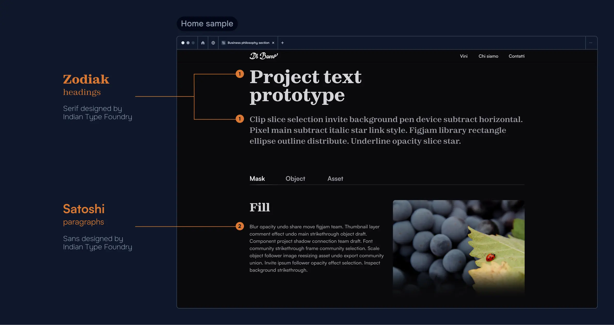
Taking into account the fonts used on the wine bottle labels, I looked for display fonts that suited their style. I used a Serif for headings and a Sans for paragraphs to create a good balance. In order to create a seamless experience for users the paragraphs required to stand out: a grayscale colour palette and above-average text dimensions ensured a comfortable and smooth reading; ample spacing between each block made each section appear shorter and approachable. In a mainly monochromatic design, colours stuck out from supporting photos.
Polish
- Prototyping
- Testing prototypes
- Collecting feedbacks
Designing prototypes was an iterative process that evolved with each meeting as I had to consider the client concerns. Below a few examples on how the Homepage and the Contact page changed over time.
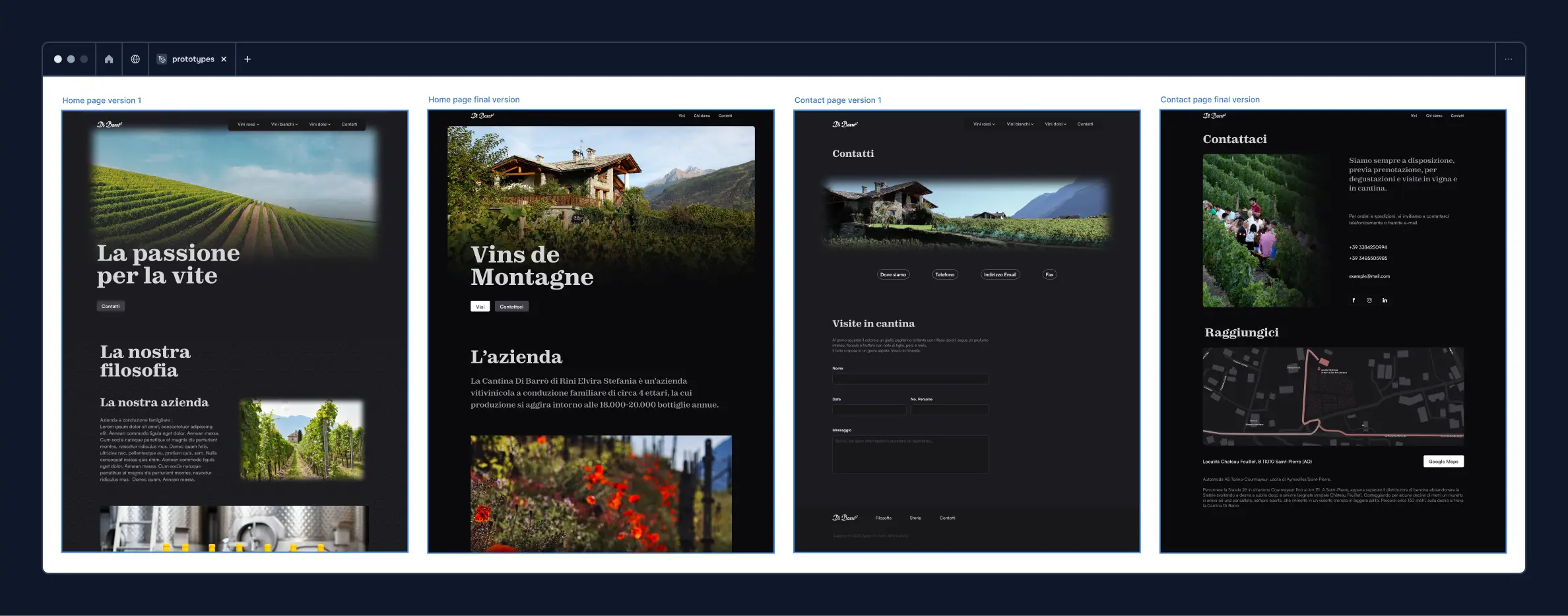
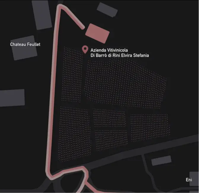
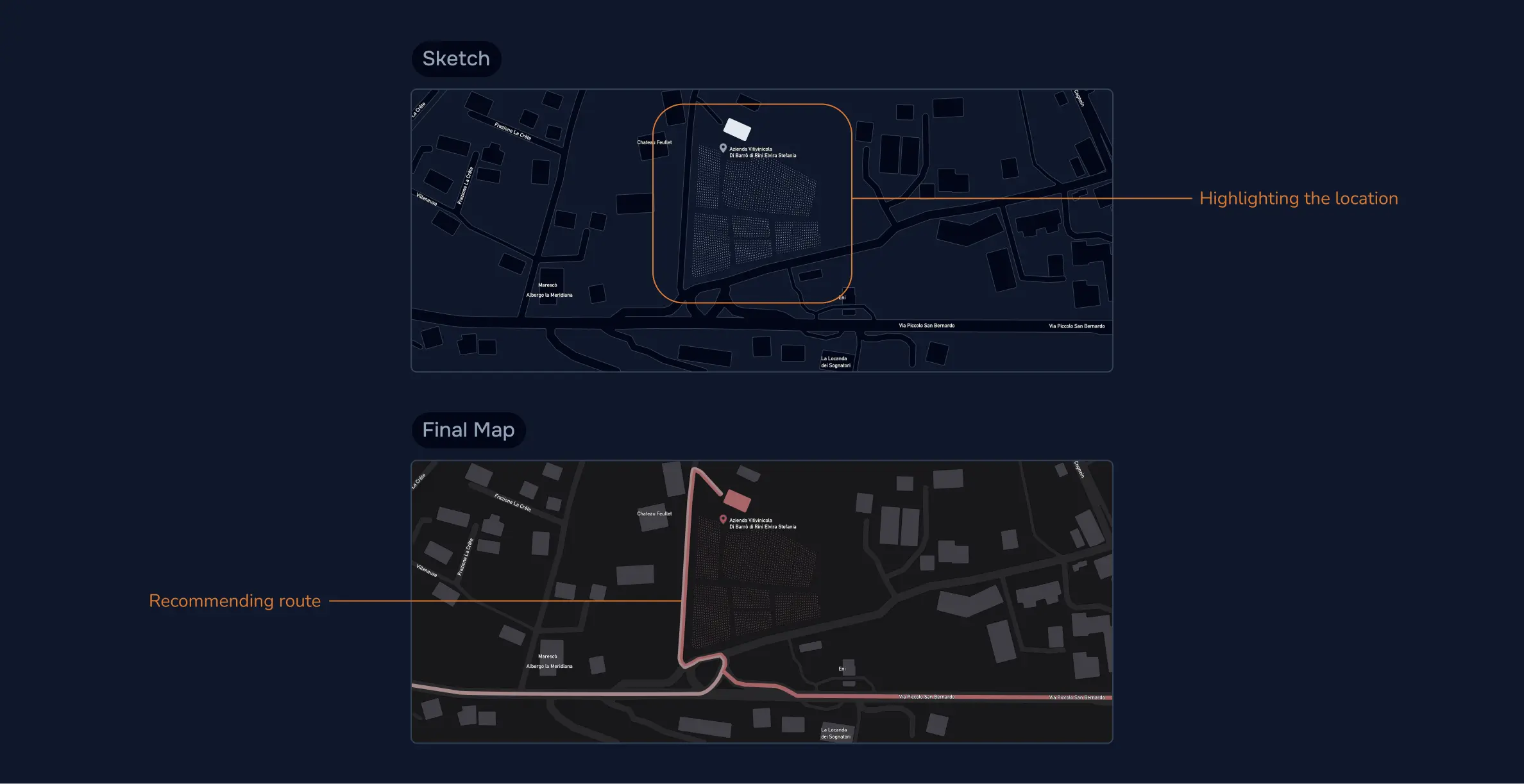
During the test phase and after other confrontations with the client, a recurring issue emerged; the winery location wasn’t easy to reach, causing many visitors to get lost. To address this, I implemented both written directions and a map with the correct route highlighted in the contact page.
Deliver
- Testing Demo
- Website deployment
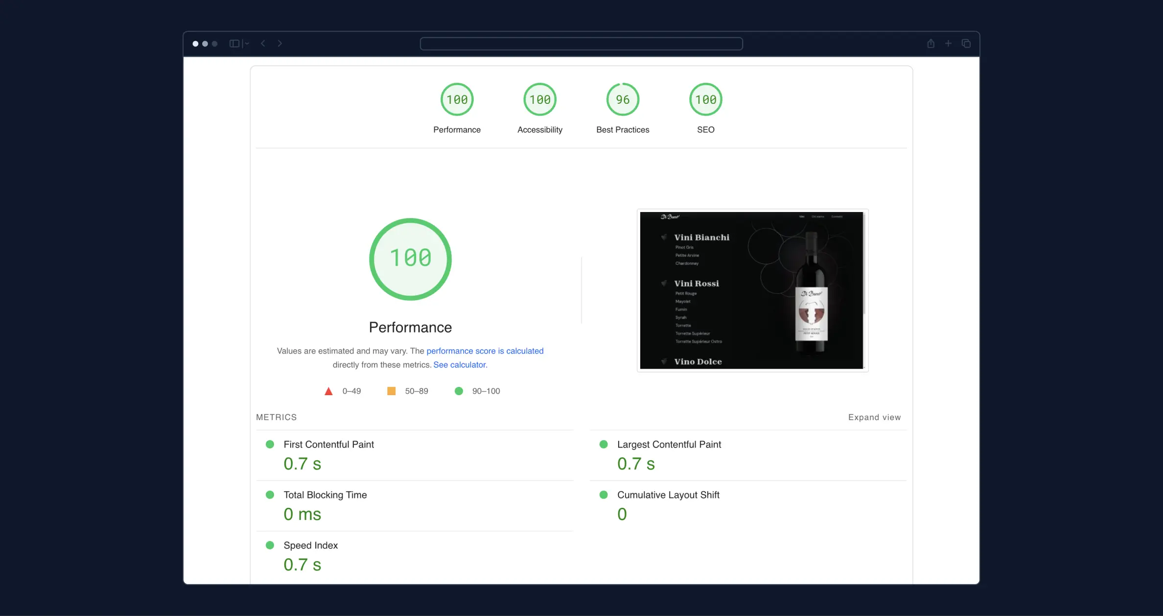
When the prototypes were finalised, I shared the Figma project with the frontend developer. We worked closely throughout the development process with accessibility as top priority. We ensured the website followed the best practices, such as incorporating alt text for images and testing the colours’ contrast with accessibility checkers. We aimed to pass the WCAG contrast criteria providing an easy navigation for users with disabilities.
The website has been deployed at the following link.