Ideating a Dentist's website to promptly present the clinic and positively impact users
Overview
After several years in business, the dentist’s son took over the family’s dental clinic, known for its high standards in dental treatments and patient care.
He wanted to reach a broader audience and sought a new website to attract more patients and compete effectively with other dental clinics.
I was the sole designer in this project and I was responsible for the whole design process, from learning about the client’s goals to helping them get there with the developer’s help.
Connect
- Meetings with client
- Competitors’ analysis
- Heuristic research
- User persona
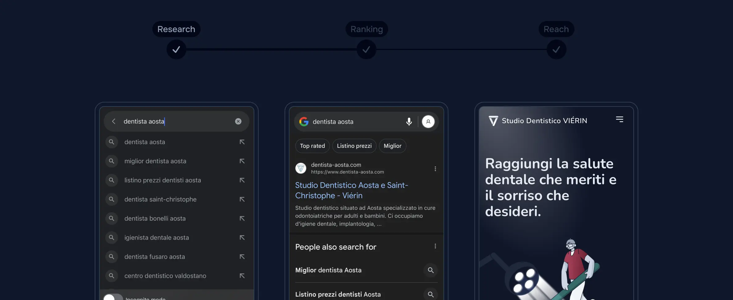
The website was intended for reaching and attracting new possible patients, since the dental clinic offers mostly an in-person service, the user needs to be physically there to access the service. Thus we were aiming for Google’s impressions and clicks of a selected target user.
Meeting with the client to gather all technical information was crucial in defining the client objectives, target user and visual style. The client wanted to differentiate his website from competitor's, trying an original approach and stand out, evincing the style he was looking for.
While analysing competitor websites I identified their content strategy and discovered some common traits among their websites. All of them shared a large number of pages and an old forum-like layout, with a lot of explanatory text surrounded by stock photos. This type of website usually draws users trying to identify their medical conditions reading resources on the Internet but not necessarily searching for a dentist appointment.
- Find precise descriptions of the treatment process
- Educates patients about benefits and potential risks of treatments
- Increase the time users spend on the website
- Need medical terms’ knowledge to understand
- Risk to skim the content and miss key points
- Harder to read, especially on mobile
Narrowing down the target user, our selection was composed of patients seeking oral hygiene, individuals in urgent need of dental procedures, parents bringing their children and those interested in cosmetic treatments like lip fillers. By interviewing and analysing the responses of the diverse users involved I was able to build 3 user persona.
User Persona
Monica Petti
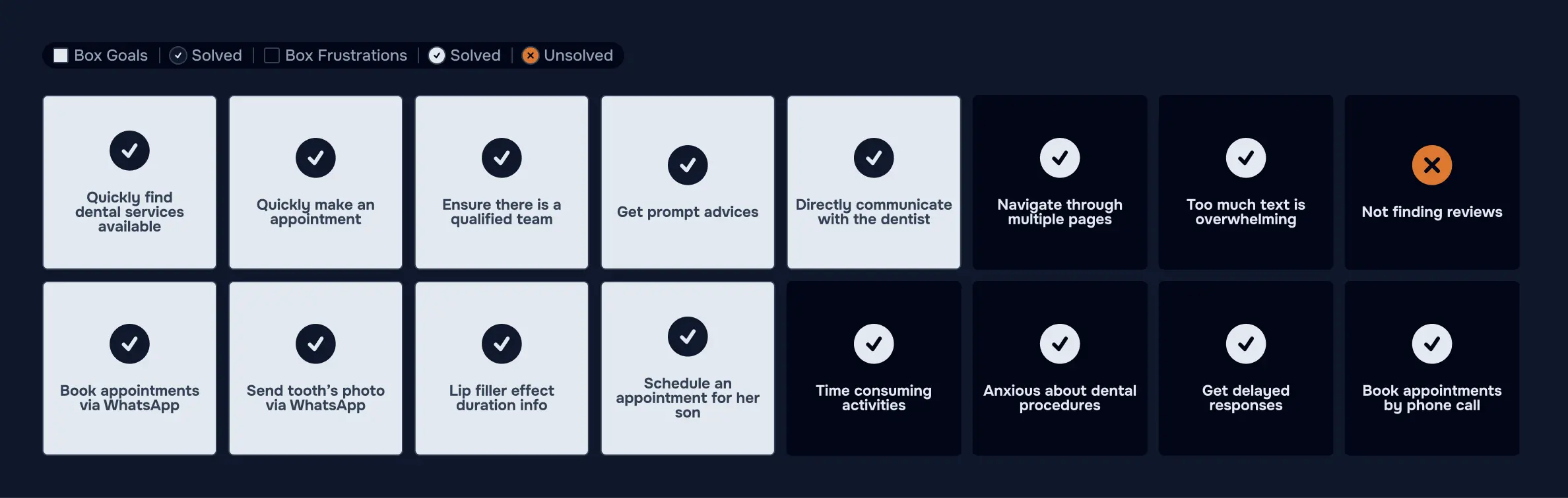
Monica is a working mum, she is usually really tired, constantly divided among job, household chores and childcare. She is overprotective towards her children therefore she doesn’t trust a service in information's absence or inaccessibility. She needs to quickly understand because she lacks time and energies. Her son has a tooth decay.
- Quickly find dental services available
- Schedule an appointment for her son
- Directly communicate with the dentist
Navigate through multiple pages
Too much text is overwhelming
Time consuming activities
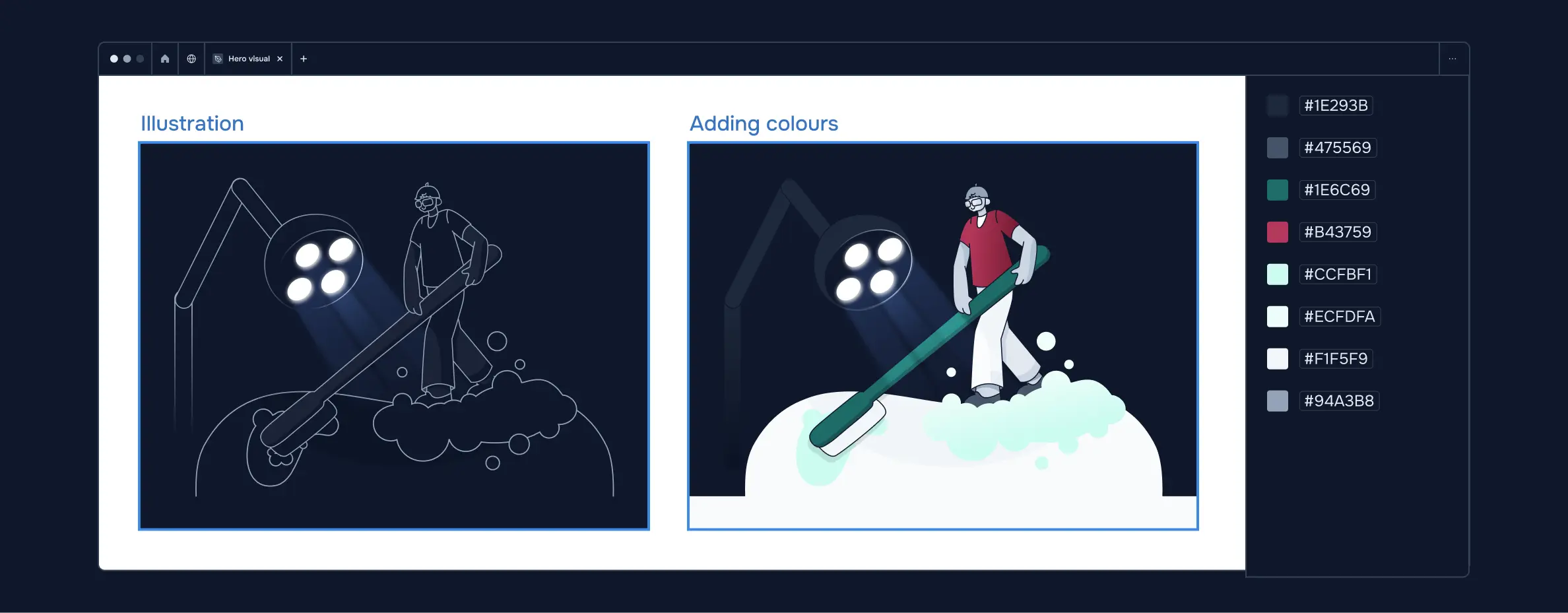
I could assess most of them aimed for quick answers and effortless solutions, due either to a great pain or a lack of time. Thus I needed to lower cognitive load on users avoiding to compromise their reasoning and decision making. Using a concise jargon-free language and breaking content in short easily digestible paragraphs, I could prevent users from feeling overwhelmed by improving content’s understanding. Adding consistent and customised illustrations I could provide a visual support to texts, evoke users’ positive emotions and make the user experience memorable.
Craft
- Informations flows
- Typography
- Visual design
- Wireframes
Once the connection was set and decisions taken, it was time to meet the client’s and potential patients’ expectations, designing the informations’ structure and the experience for the user.
I carefully balanced strategic text blocks and positive tailored visuals, to achieve a good content's readability and cohesive visual style.
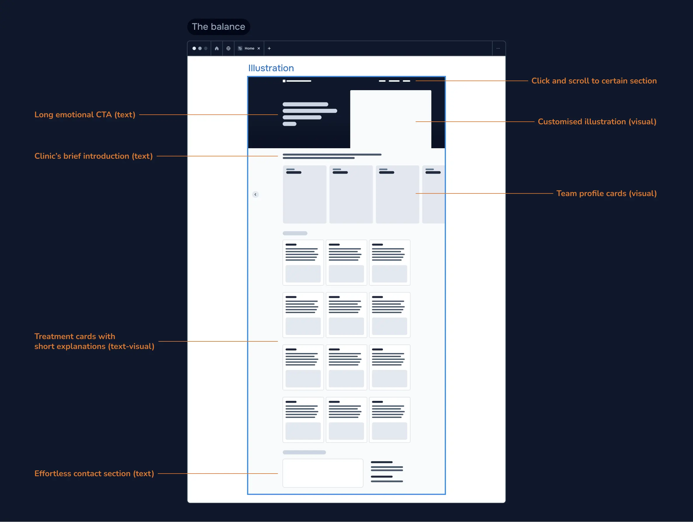
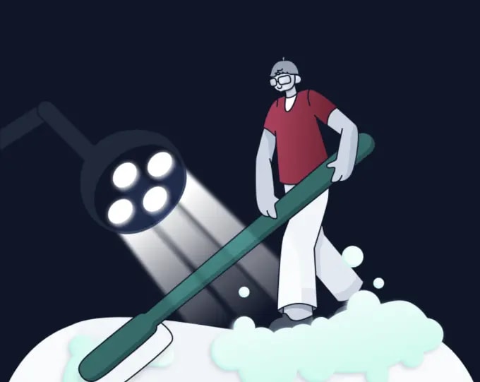
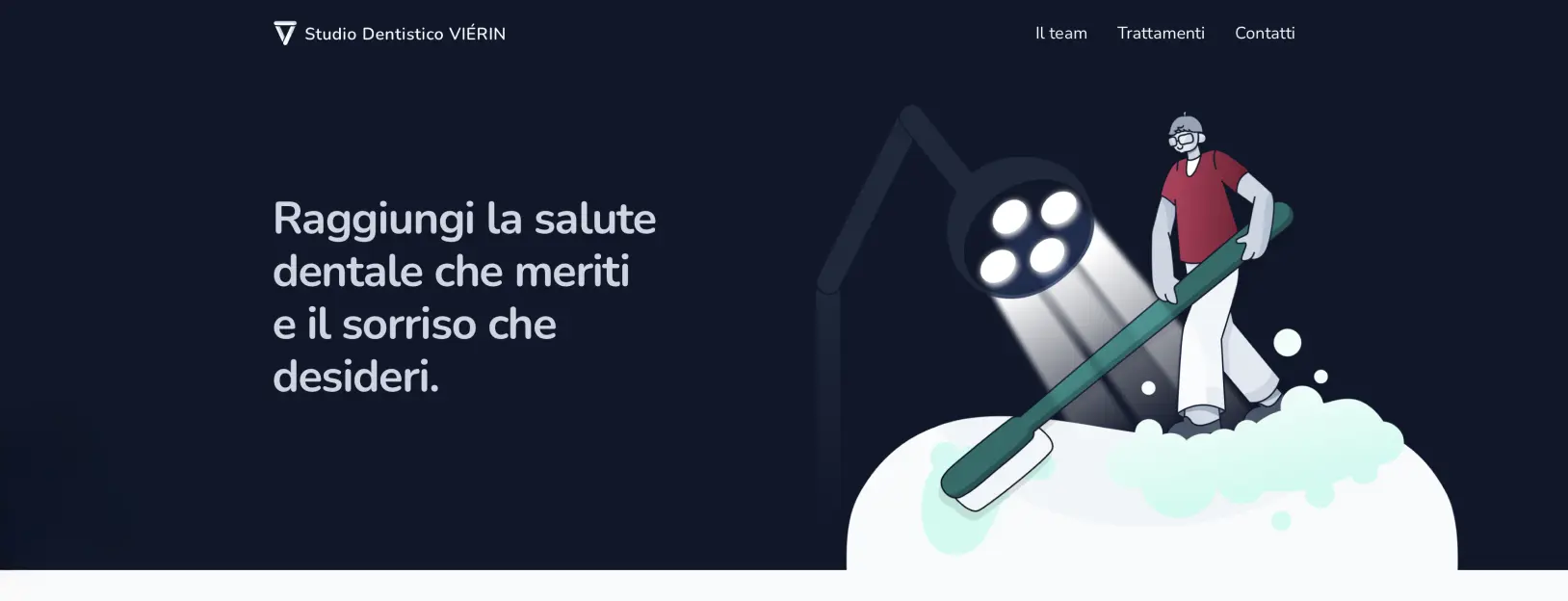
Upon entering the website, the Hero Section warmly greets the users through a relevant captivating headline, speaking directly to their needs, apposed to an attention-grabbing visual, showcasing one of their most common services. With these decisions, I wanted to prompt the users to linger on the website for treatments and appointment informations and lead them to envision themselves accessing the service.
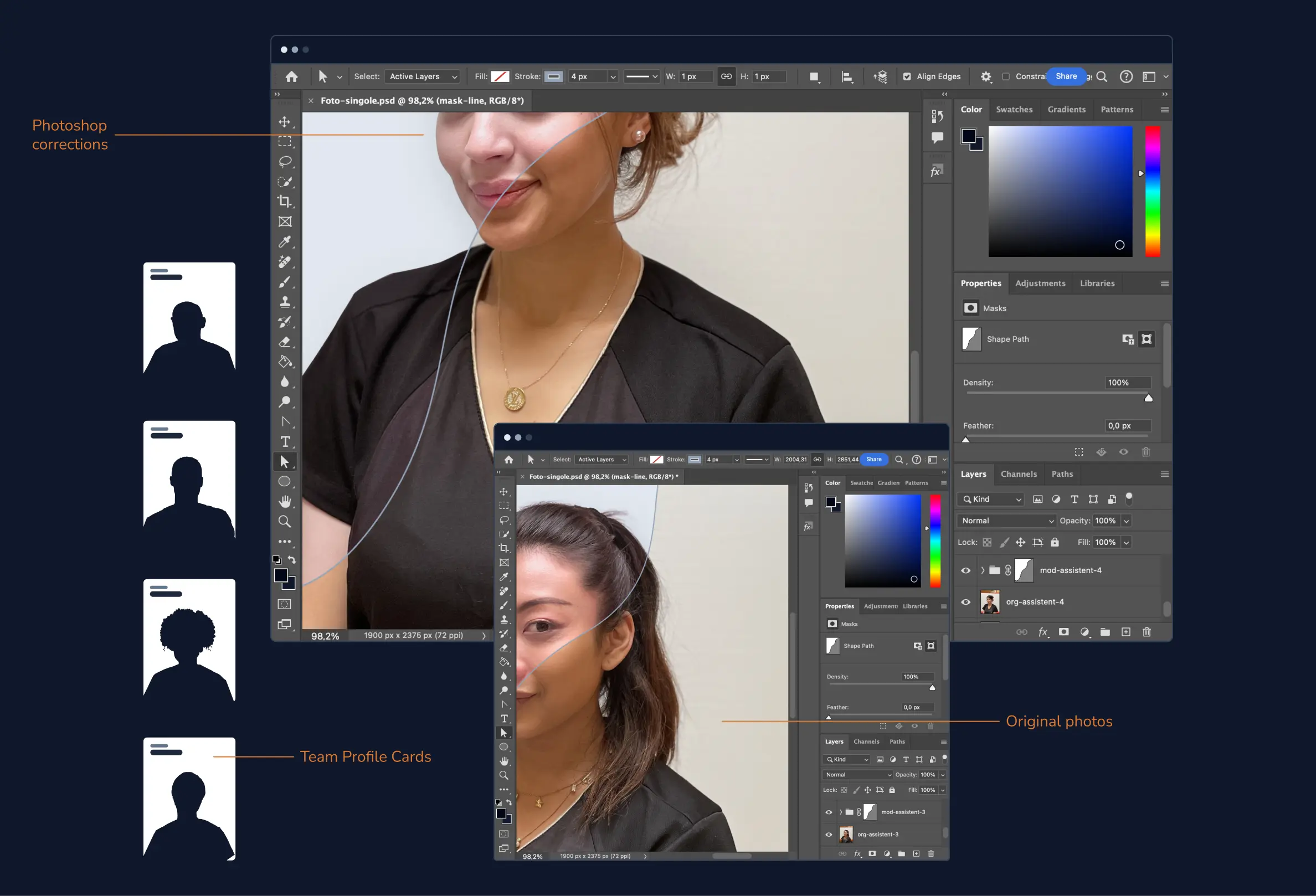
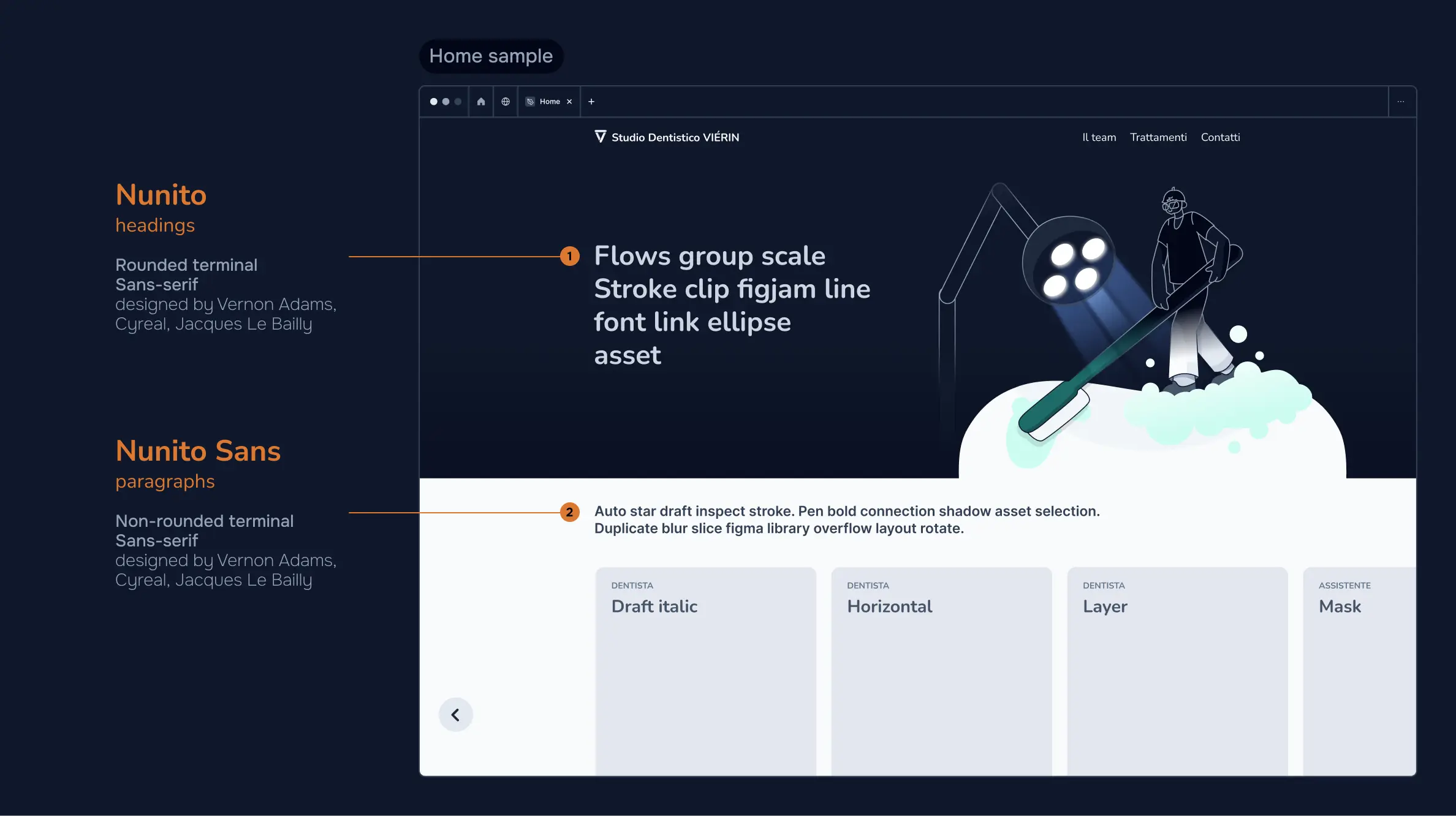
To enable users to build familiarity with who will assist them, the Dental Clinic introduces its team, providing each practitioner with a profile card, comprehensive of role, name and photo.
Aiming for the best achievable outcome, I edited the profile photos in Adobe Photoshop, retouching minor imperfections, enhancing them through colour correction and ensuring uniform lighting.
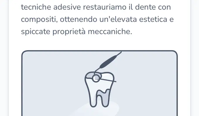
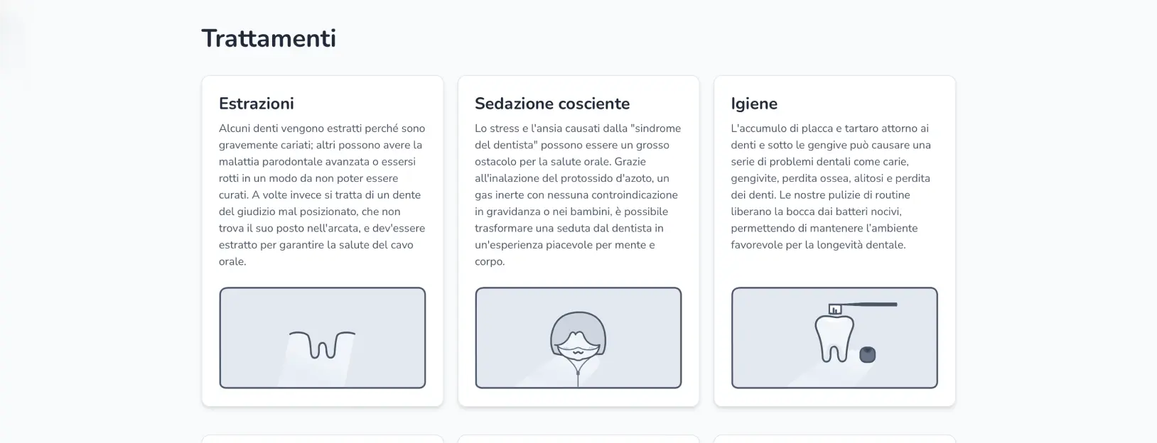
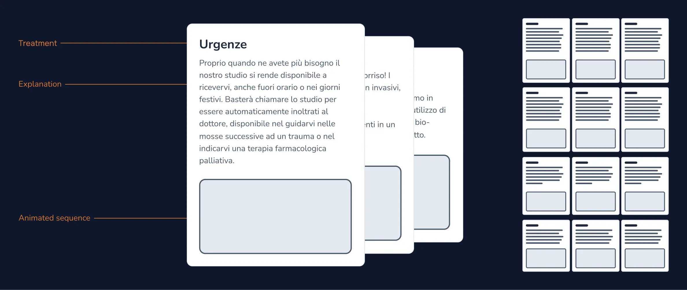
A grid was the cleanest choice to organise each service. All 12 cards contained a customised animated sequence and a concise explanation of the dental procedure. While developing explanations, I revised all the material gathered and kept the core concepts only. Then I identified the most relevant and frequently searched keywords related to dental treatments and included them in the final content.
By searching dental procedures on the internet, many disturbing images can pop out and easily scare a patient already anxious and in pain. I was intent on making users, rushing on this website worried about a sore tooth, sparkle with positive emotions while exploring the treatments section.
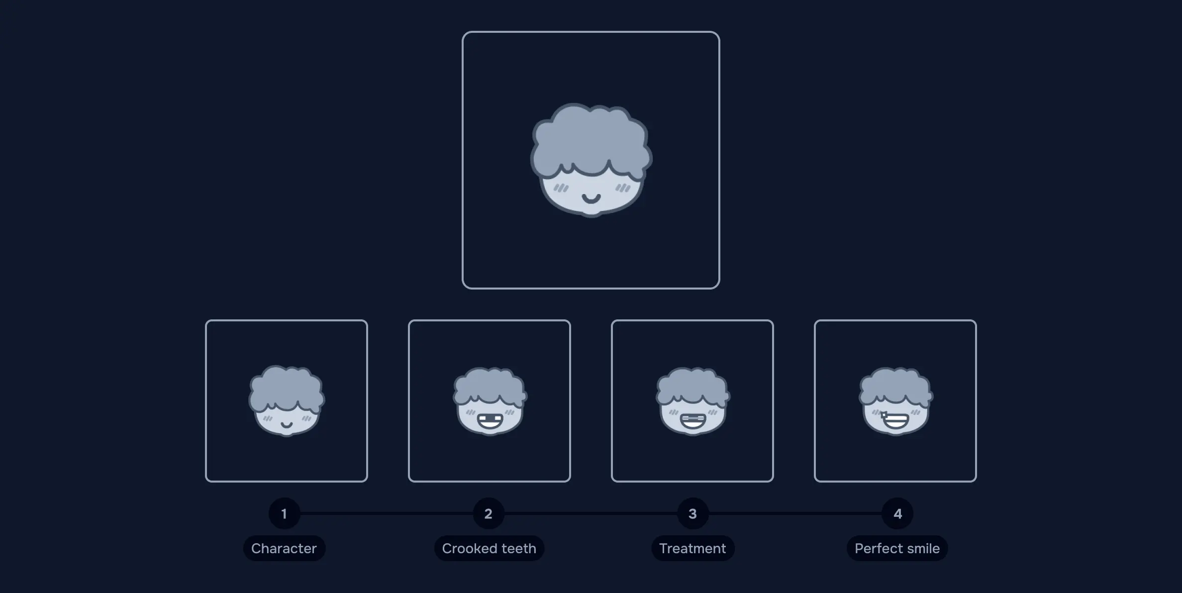
Hence to support treatments explanations, I provided customised Illustrations graphically conceptualising each scenario and allowing users’ imagination to fuel their understanding. These images had to be pleasant visual aids to help users grasp informations, present a unique style to be memorable and depict 12 different concepts. I tried different visual’s styles, assessing concept to clarify and available space in cards’ layout. After many considerations and some iterations, I tailored a flat icon-like style, elevated but straightforward, showcasing personality and aligning with the clinic’s brand. Then I created 4 cute characters and a rounded tooth to involve in the scenes as main figures, helping me in the representations.
Transforming all the scenes into animations was definitely challenging, due to layout and time constraints previously set. I chose which movements and changes over time various elements’ had to have, identifying the anchor points for the actions.
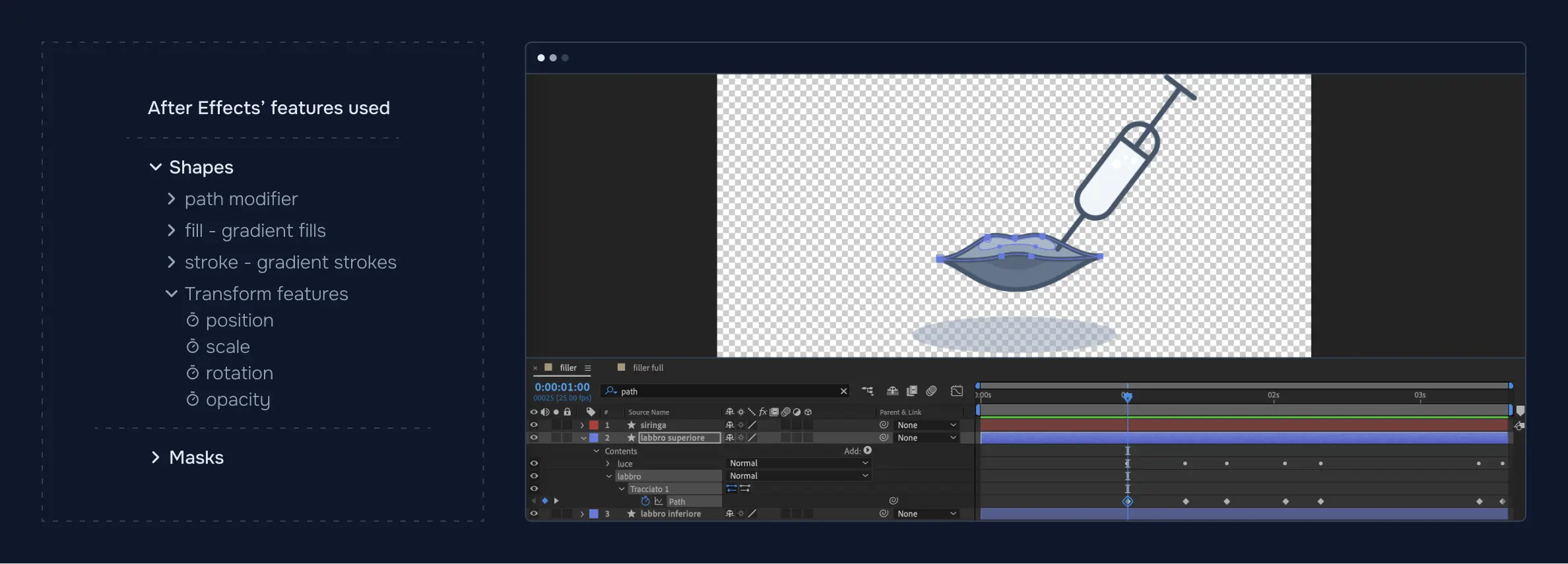
I created 4 keyframes for each sequence on Illustrator and then developed their animations in After Effects, producing the final loops. In order to minimise the file size, I used the Lottie plugin Bodymovin to export each sequence individually as a lightweight JSON file.
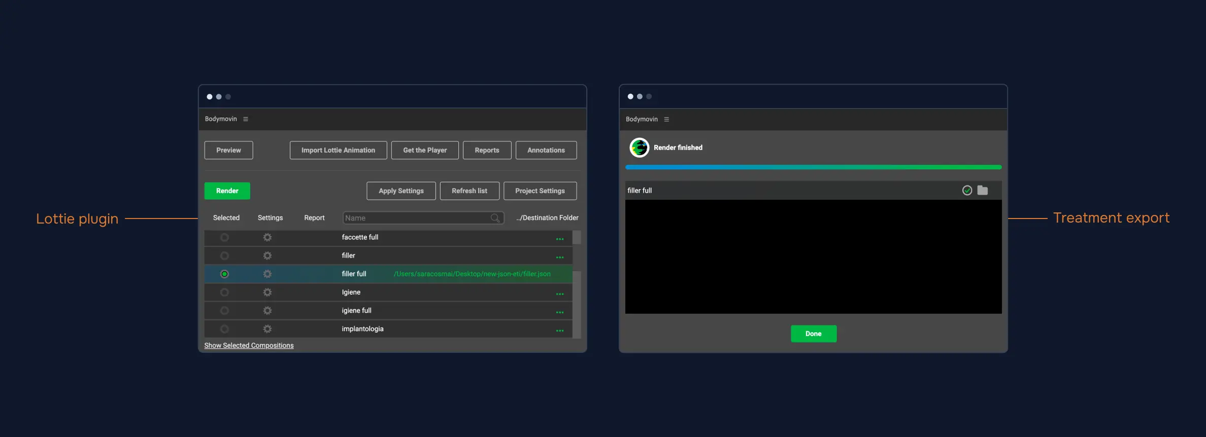
Unfortunately the plugin doesn’t support many After Effects’ features yet. It clearly limited my range of action but it challenged me to animate all the elements using the path shape modifier and the transform features. All the light weighted animations piled up, each reaching a better optimisation’s level for the webpage in the deliver stage.
When choosing typefaces, I considered possible emotive responses to the letterforms and if multiple weights and styles were included. I selected a font that aligned with the brand and improved overall readability; a rounded sans-serif font meant for display typography and its non-rounded terminal version.
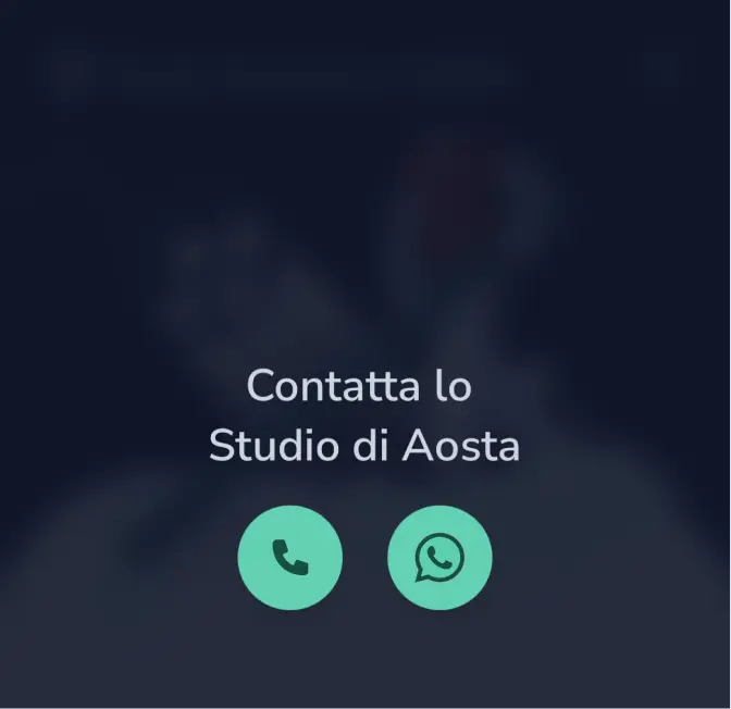
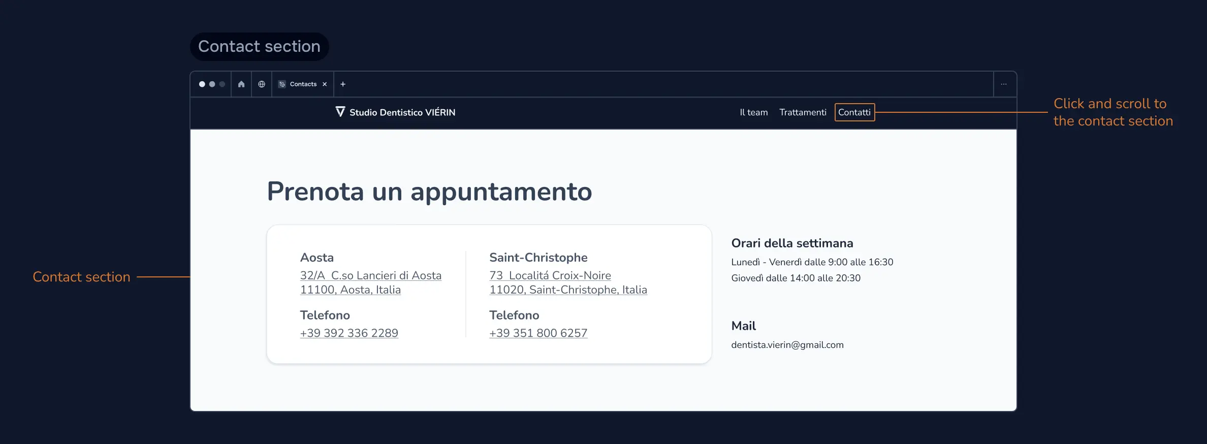
To facilitate user access to informations, I placed on the top nav bar quick action links, such as contact. These links on user’s click scroll to the relative section, saving user’s time in the information’s research.
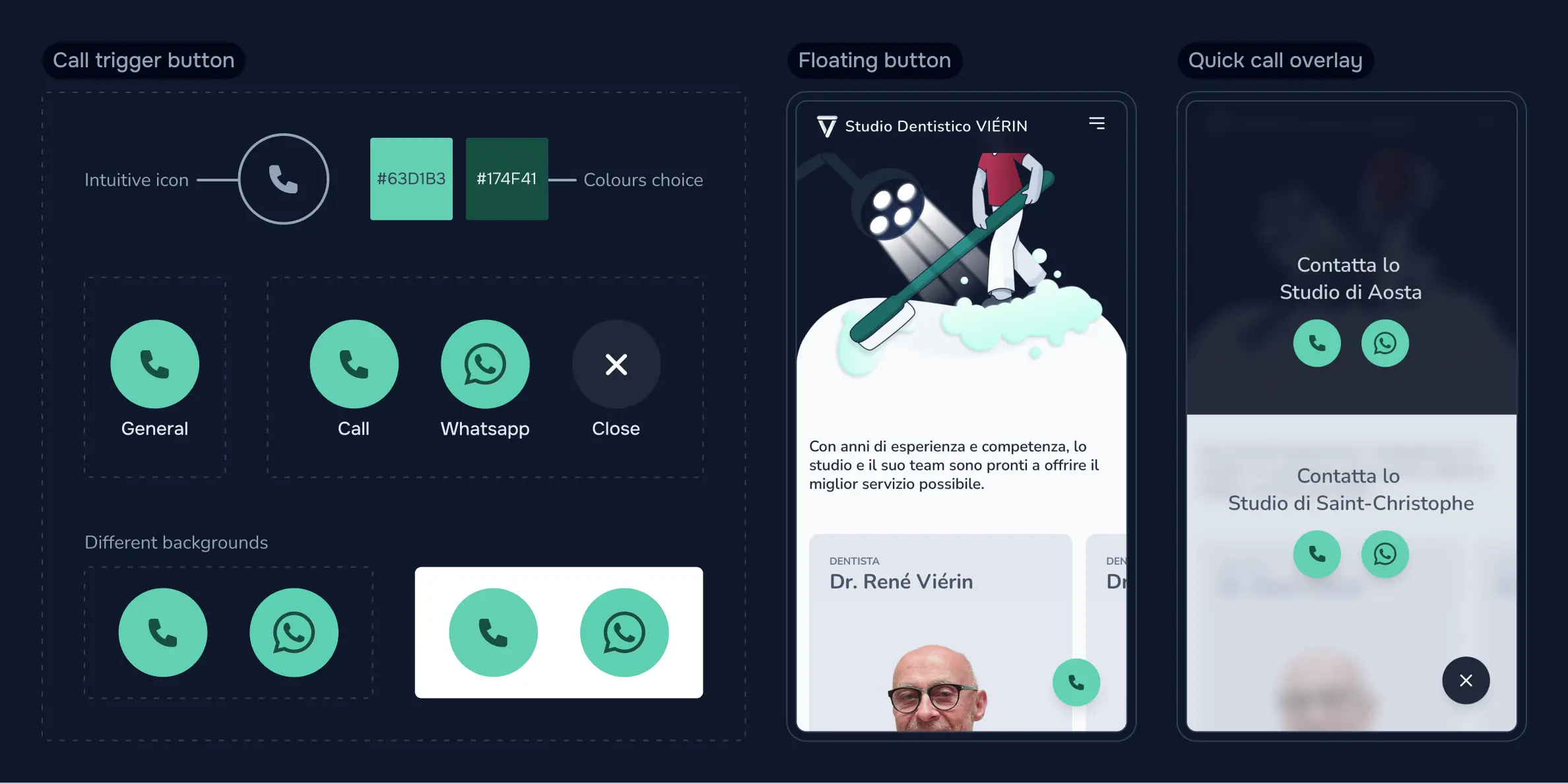
For the mobile version, a floating button is consistently visible in the lower right corner of the screen. This button serves as a direct call trigger to the Dental Office, proving particularly useful in emergency situations.
Polish
- Prototyping
- Testing Prototypes
- Collecting feedbacks
After testing the prototypes, I reviewed all the user’s goals and frustrations one last time, making sure the user experience fulfilled expected standards.
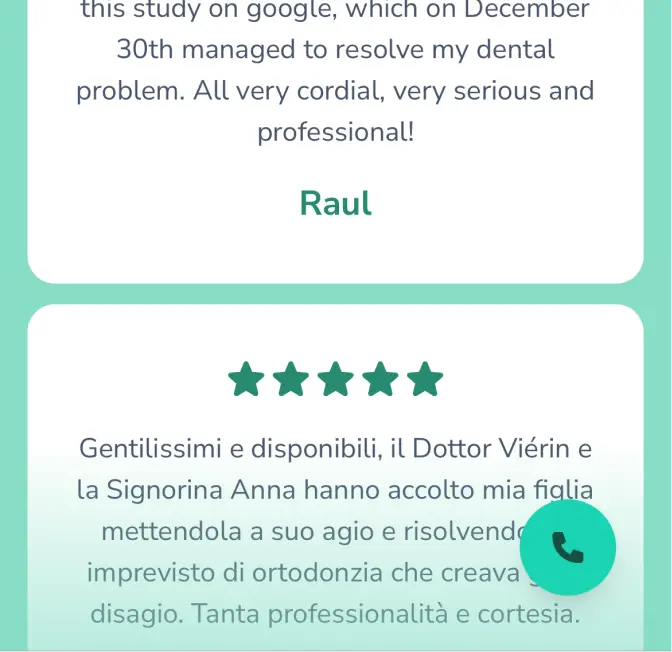
By visiting the website, the user wanted to quickly contact, gain informations and reassurance. The primary objectives were met but the service’s quality wasn’t properly addressed and disclosed. Featuring a testimonial section could have helped users feel confident about the dental clinic’s ability to meet their needs.
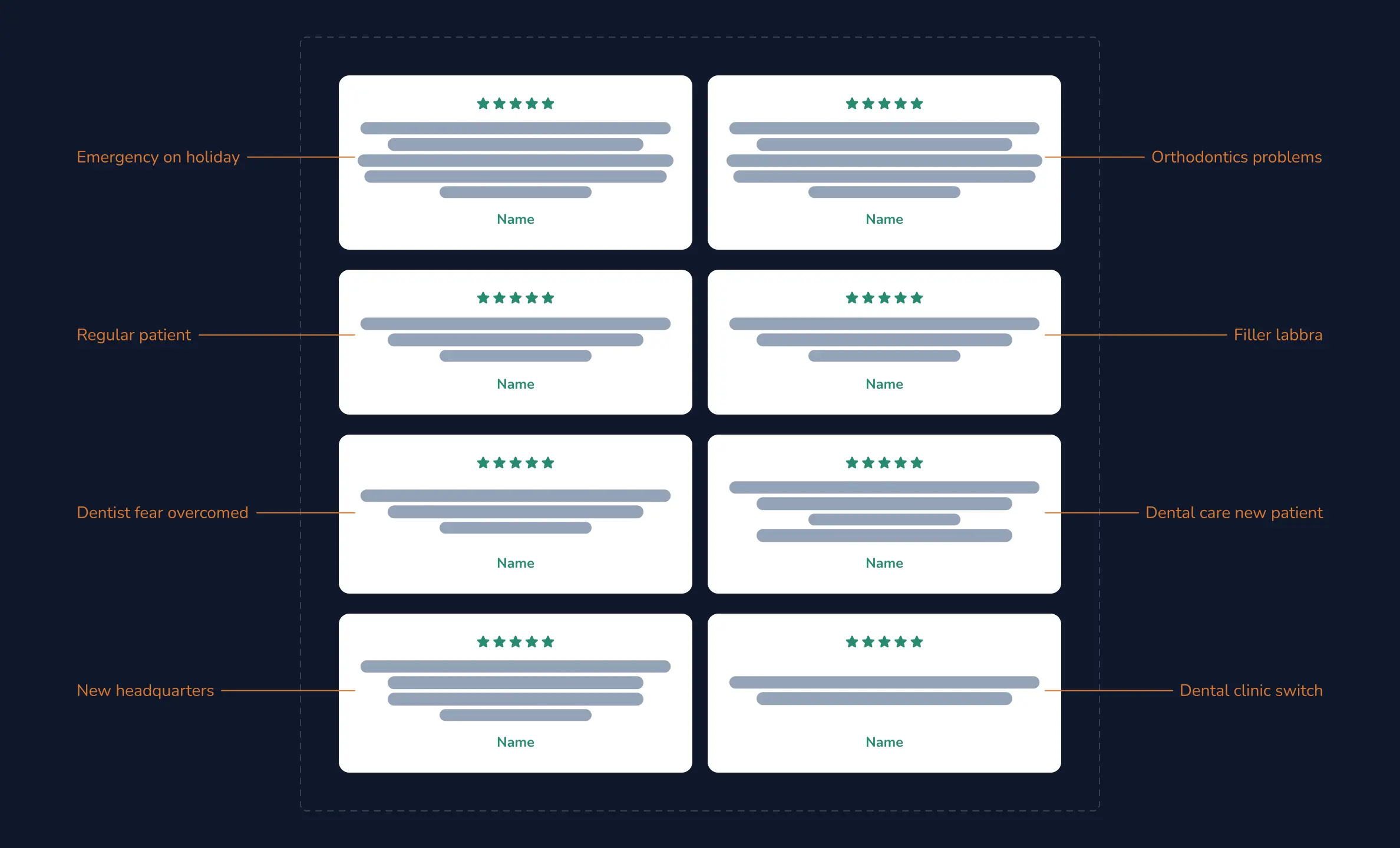
Over the years the Dental clinic had encouraged patients to leave reviews, reaching a rating of 4.9 on Google Maps. Carefully selecting some positive reviews, I designed the new section with different patients’ standpoints about the clinic. To this extent I depicted different situations, fulfilling the user’s sense of belonging and demonstrating the dental office's prestige.
Deliver
- Testing Demo
- Website deployment
I collaborated closely with the developer, visioned the final figma file, gave support in development and discussed various optimisations in order to have faster load times and to rank higher in search engine results. To reduce the visual load on users and speed up the website's loading, we decided to set the treatments' cards animations on play only when the user's cursor is on focus on a card otherwise always on pause.
The website was successfully deployed on the following link.
Takeaways
Overall I think that it was a good opportunity to test my creativity, familiarise myself with the healthcare industry and face new design challenges. While reviewing the delivered website and related data, I thought ...
- The reviews’s implementation fulfilled its purpose and proved its value becoming the most viewed section along with the Treatments and Contact sections.
- Animated visuals played a big role in the whole experience engaging users and fostering a positive behaviour in them towards dental chair